Posted on March 29, 2026 by jwindeknecht - Uncategorized

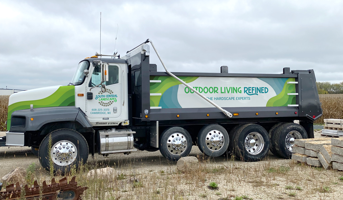
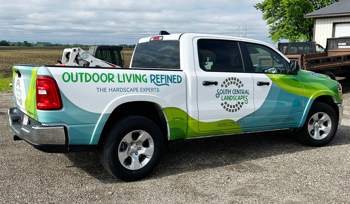
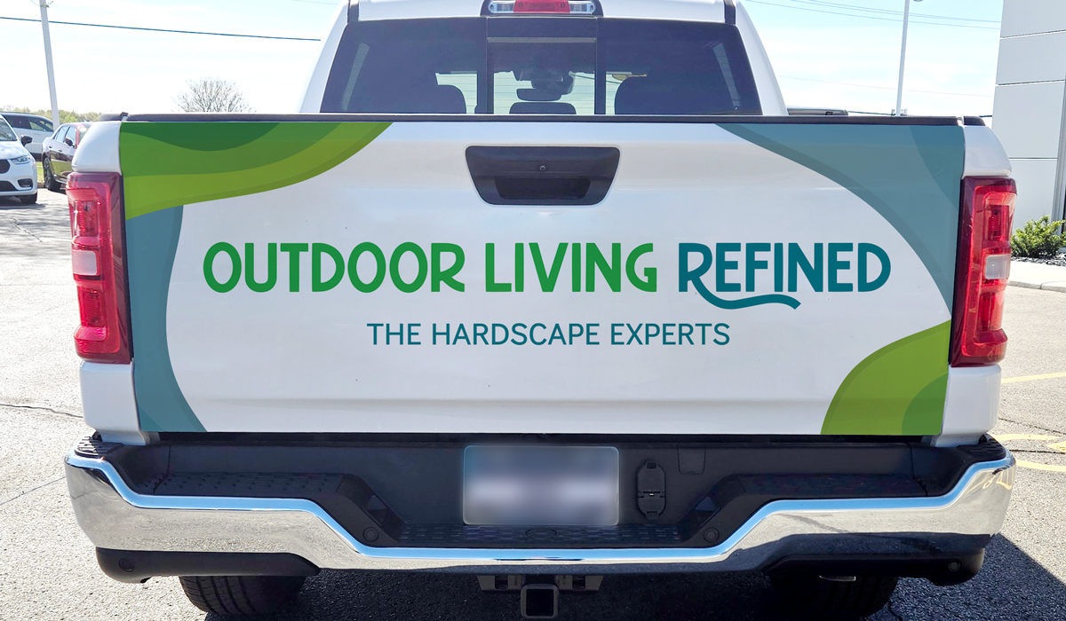
South Central Landscapes Vehicle Wrap
Following a successful rebrand, SCL turned their attention to refreshing their full fleet of vehicles. The goal was to communicate their design expertise and specialty landscaping services in a way that felt both vibrant and organic. Drawing inspiration from the forms of water features and trees as rendered in architectural plans, I developed a design that reflected these natural motifs.
Posted on March 28, 2026 by jwindeknecht - 2024

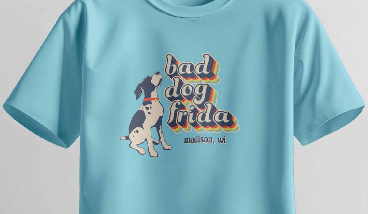
bad dog frida T-shirts
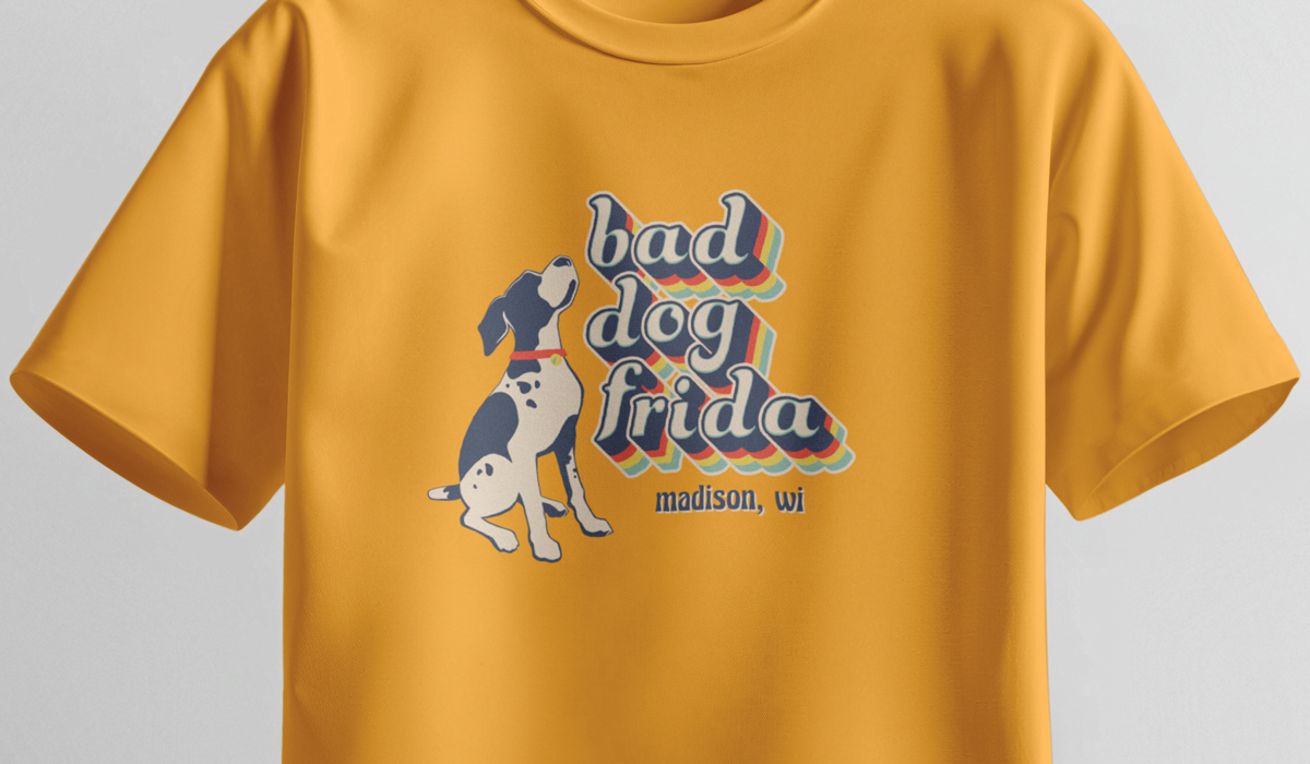
bad dog frida, a beloved local pet store, was looking to expand its brand in a meaningful way. Knowing that dog owners love to wear their passion — speaking from personal experience — branded apparel felt like a natural extension of the store’s identity.
For this project, I drew inspiration from vintage state park posters, selecting colors and typography that evoke a sense of the outdoors and a connection to nature. The shirt colorways were thoughtfully chosen not only to complement the graphic design, but to enhance the overall warmth of the piece — a quality further brought to life by the soft, heathered texture of the fabric.
Posted on November 30, 2020 by jwindeknecht - 2020
Madison Parks Foundation Website
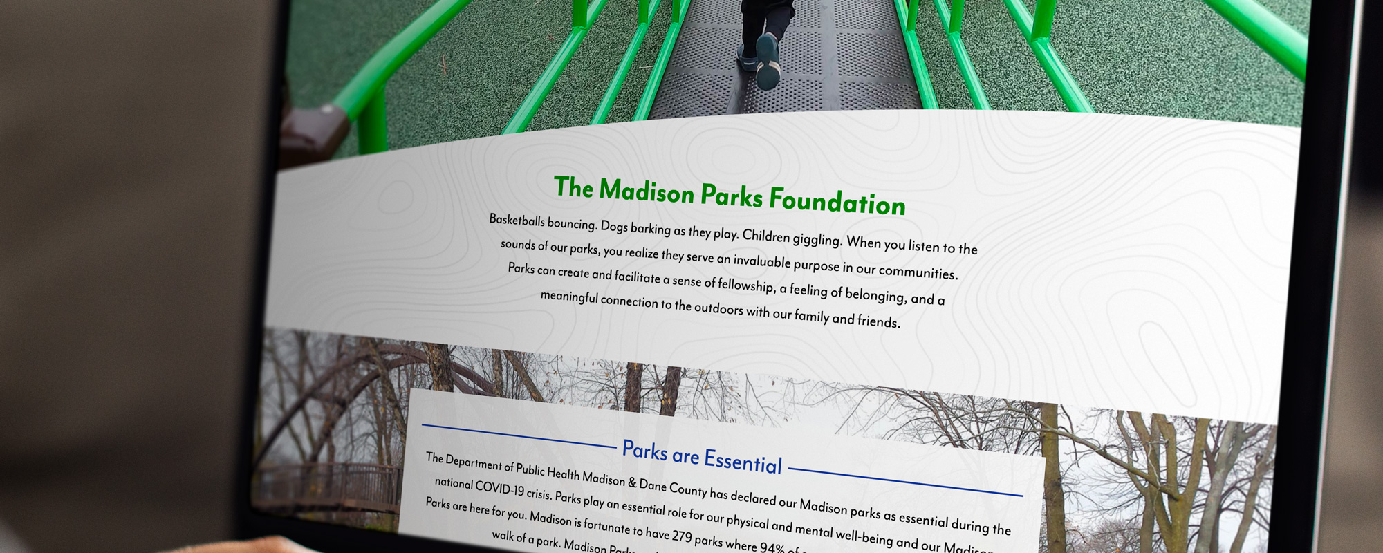
The Madison Parks Foundation wanted a new website to better engage with visitors through a less boxy, more inviting design.
I created a website that employs organic shapes that echo the dynamic lines of the Foundation’s logo to showcase Madison’s parks. I also integrated colorful landscape photos, accentuating the beauty of Madison’s parks and showcasing unique aspects of the parks such as trails, accessible playgrounds, and common areas.
Posted on November 30, 2020 by jwindeknecht - 2020

Chrysalis Annual Report
As a non-profit serving the Madison community since 1980, Chrysalis, Inc. wanted to showcase their journey of promoting mental health recovery in the community by celebrating their 40th anniversary. This tri-fold report describes their mission, the Chrysalis team, and the milestones that have been accomplished over their many years in Madison
Posted on July 28, 2019 by jwindeknecht - 2019

Salon Fido Branding
Seeing as I’m a dog lover, I was more than happy to create a brand for Salon Fido. The client wanted the feel of a classic, retro salon, applied to canines.
The typeface and colors I chose sought to reinforce this concept and I opted to place the dog “looking to” Salon Fido for its grooming needs.
Collateral was designed to create brand awareness and provide an additional income stream to the client.
Posted on June 30, 2019 by jwindeknecht - 2019

Downtown Madison Business Improvement District Branding
The objective was to design a versatile logo and website for a diverse group of businesses within the Business Improvement District (BID). The shape of the logo draws its inspiration from a map of downtown Madison, referencing one of the corner streets that borders the capitol.
The guidelines detail how the logo can be used alone and in conjunction with photos and other logos. The colors were chosen to mimic the colors of the seasons in Madison, further reinforcing the local connection.
Posted on June 30, 2019 by jwindeknecht - 2019

Foundation for Madison’s Public Schools Branding
The Foundation for Madison’s Public Schools’ (FMPS) branding had been established decades ago, however there were no definitive guidelines in place. FMPS also requested an update to their logo, finding the original dated and no longer relevant.
I updated the logo and set up guiding principles for usage. I established their brand colors, discussed how they were chosen and described their controlled usage moving forward.
They were provided with additional principles, documenting proper photo usage, typography, and specifications for digital and printed branding.
Posted on May 28, 2018 by jwindeknecht - 2018
EDS Wisconsin Inc. Branding Initiative
The Ehlers-Danlos Society (EDS) of Wisconsin, Inc. is a new non-profit, seeking to educate patients, families, and physicians in regards to the condition. Seeing as I have a family member with this condition, I was happy to oblige as this was a cause I was strongly behind.
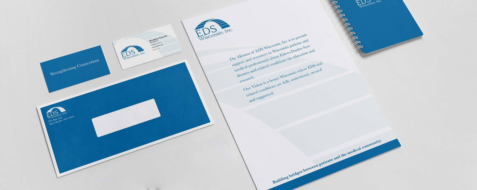
Their main focus of the EDS Wisconsin Inc. brand was an image of connections, joining, bridging. The latter of which I chose to focus on. I chose to have the direction of the bridge appearing to start in the foreground and move forward, emphasizing a positive model for the organization.
The zebra pattern is often associated EDS, however the client wanted to avoid using this imagery in regards to the central brand. Seeing as it is so popular, I recommended it to be integrated into the tangible materials that would be collected by interested parties.
Posted on May 17, 2018 by jwindeknecht - 2017

UW Colleges Website
The UW Colleges website was in desperate need of an overhaul, both structurally and visually. I collaborated with the project manager and web developer to discuss the target audiences, establish goals, and determine necessary information.
I knew this had to be a responsive website. Mobile viewership had grown exponentially in the past few years, internally and globally. I also knew that we needed the website to be accessible. Colors were carefully chosen to remain within brand standards while still adhering to accessibility standards. Alt tags were mandatory as well as set ARIA roles.
Seeing as our main audience were late highschoolers, I knew the information needed to be accessible and quickly. I incorporated large, bold photography paired with rich colors to create a visual hierarchy. “Mega” menus were integrated into navigation and content, presenting the viewer with all available content.
Posted on May 5, 2018 by jwindeknecht - 2017
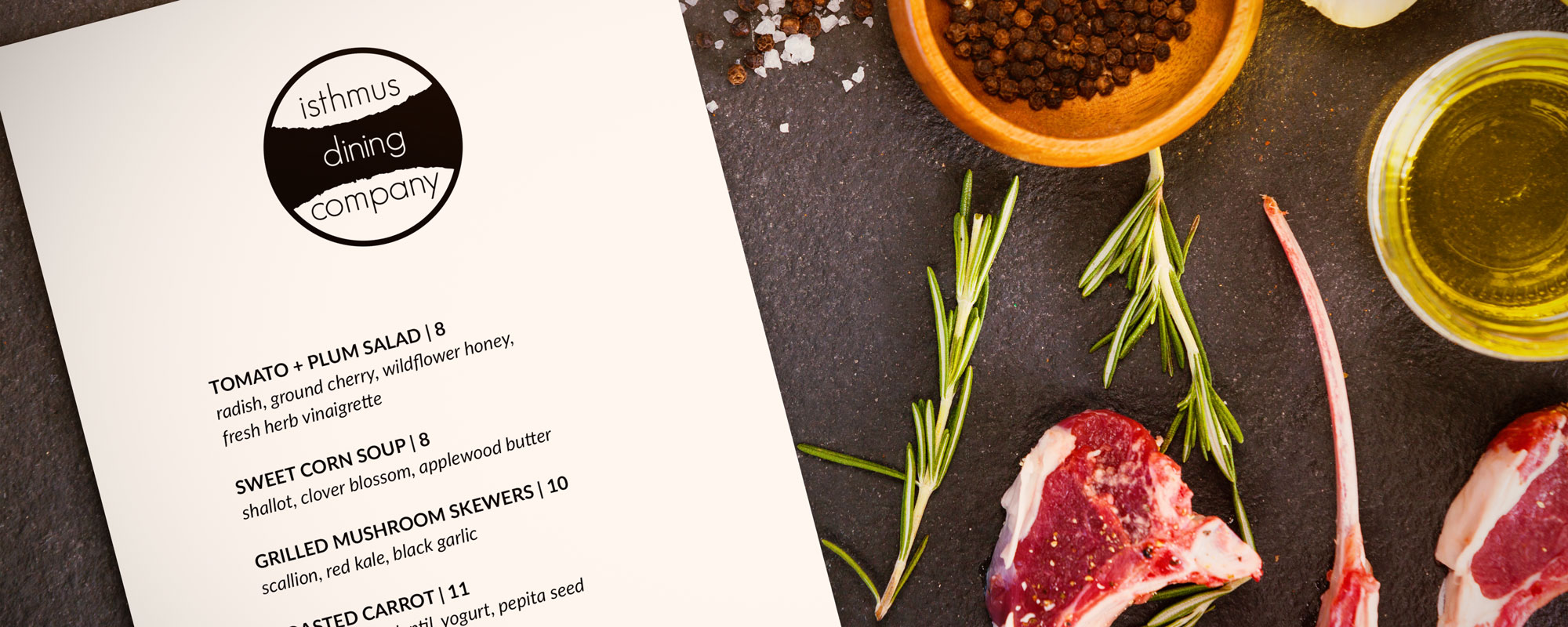
Isthmus Dining Company Branding
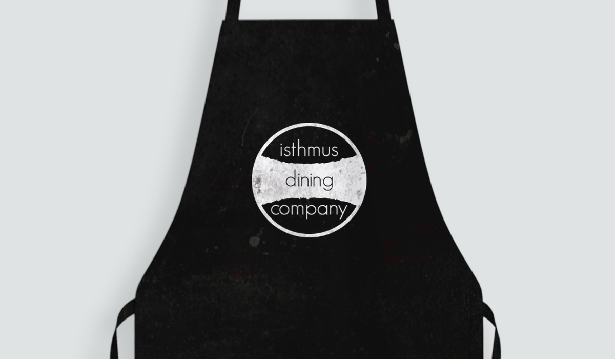
I was approached by the Isthmus Dining Company in creating a brand for their new business. Seeing as the owner was a native of Madison, WI, he wanted to feature the iconic Madison isthmus in the logo.
The isthmus you see in the logo is the actual shape and shoreline of the city isthmus. I thought it very important to establish to customers that this was a local food establishment, a “one-of-us” feel if you will.
I opted for a thin, “modern” font and focused on using lowercase letters to reinforce the local “small-town” motif.